Behind the Scenes of Conservation: Colour Matching
Conservators usually do some practice and undertake tests before actually implementing conservation treatment, but they are not something that can be observed by looking at a treated object. This column will focus on colour matching, which I practised repeatedly while I was studying cultural materials conservation.
Areas of loss, for example a chip of a ceramic bowl filled with a conservation material, can be coloured/toned for visual compensation. Colour matching is executed by mixing paints or pigments to obtain the desired colour to paint these areas.
Painting/toning must be confined only to the areas of loss. It is needed to avoid painting the surrounding areas to camouflage the wrong colour on the loss, thus accurate colour matching is important.
A desired colour differs from each object. Sometimes it is necessary to create a colour as close as the surrounding colour, but some losses are decided to be left unpainted, for instance, when the original colour is unknown. Anyway, in the practical classes, I would repeatedly practise reproducing the colours as accurately as possible.
This photo shows the result of my first colour matching. I picked some colours from colour samples and mixed some acrylic paints to obtain the desired colours. The photo is not great but still you can tell that I failed. The greyish green on the bottom left is especially bad. If I used this colour in actual treatment, the area of loss would be very noticeable. The yellow green on the top middle and the yellow on the top right are much darker than desired. Acrylics tend to appear darker when dried, so it is possible to obtain the ‘right’ colour on the palette which turns out to be wrong.
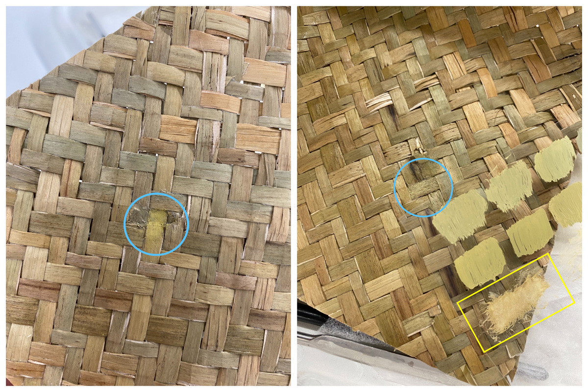
A strip of tinted Japanese paper was attached to a broken basket. In the photo on the left, the paper strip appears much yellower than it should have been, and even worse, the paint was applied to the basket itself in a later attempt to adjust the colour.
In the photo on the right, the colour matching was almost successful, however, more transparent paints should have been used. Fibres of Japanese paper were tangled and are visually disturbing. I should have dyed the Japanese paper before adhering it to the basket in order to avoid entangling the fibres with a brush.
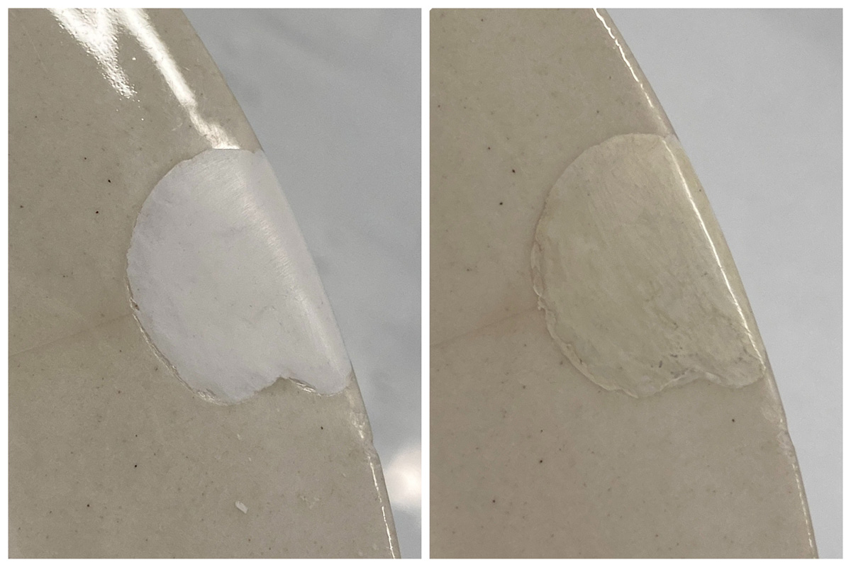
Right: The filled area was painted, then waxed for glossiness.
Before actually treating a ceramic plate, I exercised some practice using a mock ceramic bowl. A chip on the white bowl was filled with white material, but the whites are in completely different colours. White, brown, and yellow paints were used to obtain the white of the bowl. A few layers of the paint were applied as I learnt from past classes. During conservation treatment, the treated area seems to appear very distinctive to a conservator’s eye, but viewers rarely look at an object from as close a distance as conservators would do from. It is therefore important to look at an object from some distance and from different angles.
Has my colour matching skill improved through these practices and failure? I would like to colour-match the three colours again from the very first trial. You can also try it at home as it does not require any special tools.
You will need:
・Colour samples
・Drawing paper
・Paints (Most colours can be obtained using white, yellow, red, and blue)
・Brush (Preferably washed and dried beforehand)
・Palette
・Water to wash the brush
・Paper towel to wipe the brush
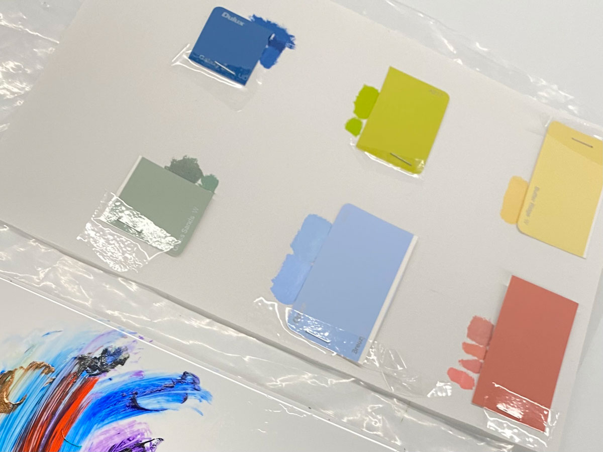
I chose three of the six colours from the first colour matching, which are the green (Grass Sands), the blue (Galaxy Blue), and the yellow (Butter Ridge). The colours were printed out and adhered to the drawing paper.
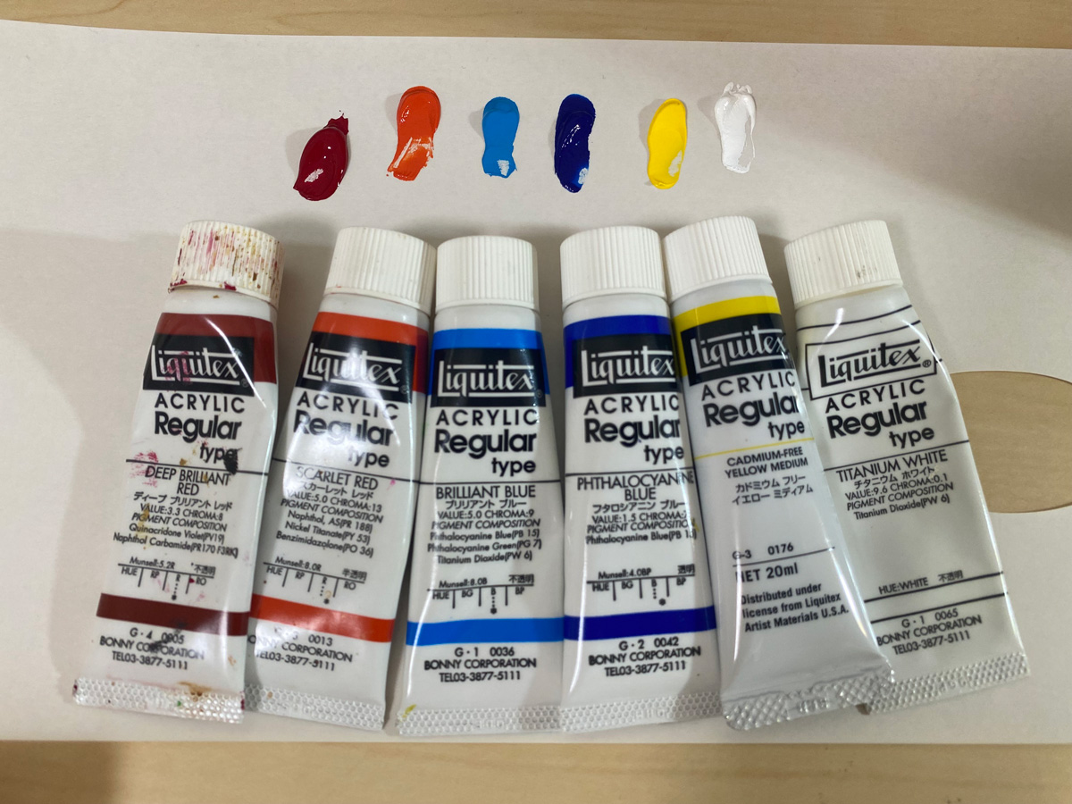
These are the acrylic paints I used. I also added purple (Liquitex Dioxazine Purple) later.
Let me start with the green. Some blue and yellow paints were mixed to make green, which appeared too bright. This green was then neutralised by adding the complimentary colour red. Black paint should be avoided because it is not easy to readjust the colour once black is added.
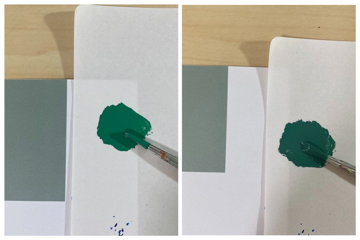
Right: The green neutralised with some red
The photo on the right shows the image after red was mixed. Some white was added to obtain the desired strength of the colour, and some yellow was also added as it appeared too blue. When a closely matched colour was obtained, a small amount was applied on the drawing paper to see how the colour would change after it dried.
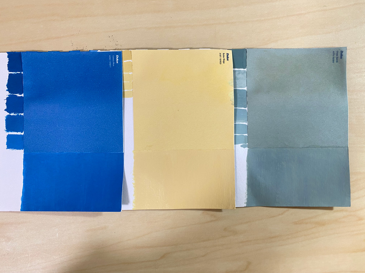
The other two colours were made as well and the results are as shown above. Finally I can display some successful examples of colour matching.
When you try to do colour matching, you should wear something like a lab coat or an apron because some paint cannot be washed off. You might also need a pair of nitrile gloves if you are using paint that contains heavy metals.
It took me more than half an hour to get one right colour since I had to mix the paints and wait for it to dry. In the actual treatment, this could be much longer because in many cases conservators need to prepare several colours for an area of loss.
Before finishing the column, I would like to add that I wrote this column solely based on my experience, and that practices may vary in different fields of conservation. It would be a great pleasure if you have got some ideas of how many steps conservators take before actually implementing treatment.
ISHIWATA Misuzu
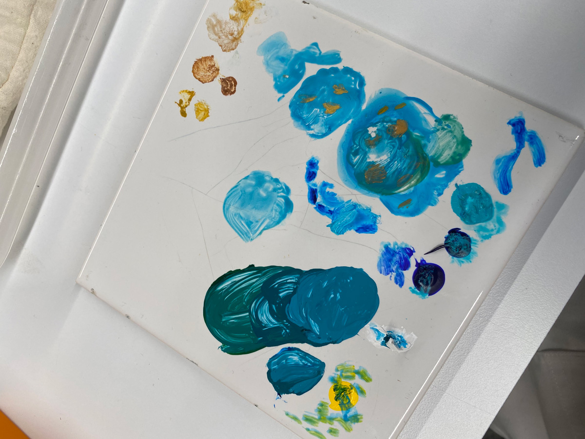
TOP: The palette I used during actual conservation treatment. The object had a gold pattern on a blue surface, and I tried to see on the palette how the gold looks on the background colour.